Tru Colors Nails
- Help an emerging nail salon with their marketing and branding.
- Create branding that shows that the salon is queer owned / LGBT+ friendly.
- Emphasize to the client the importance of branding that is clear, simple, and consistent, yet unique.
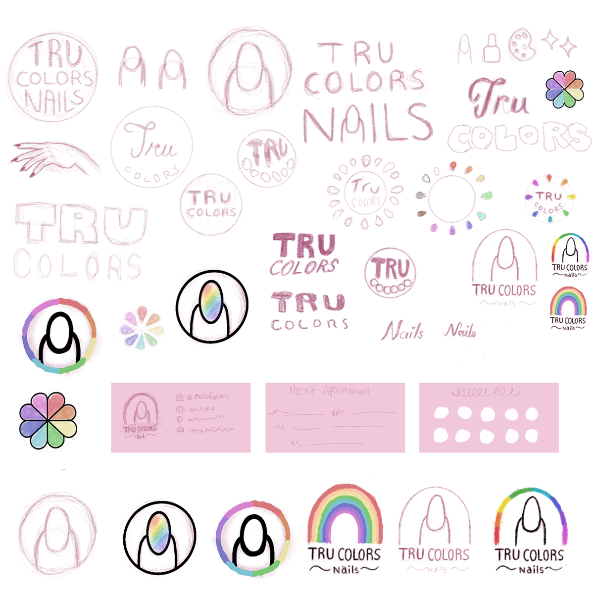
- Explain the importance of a logomark.
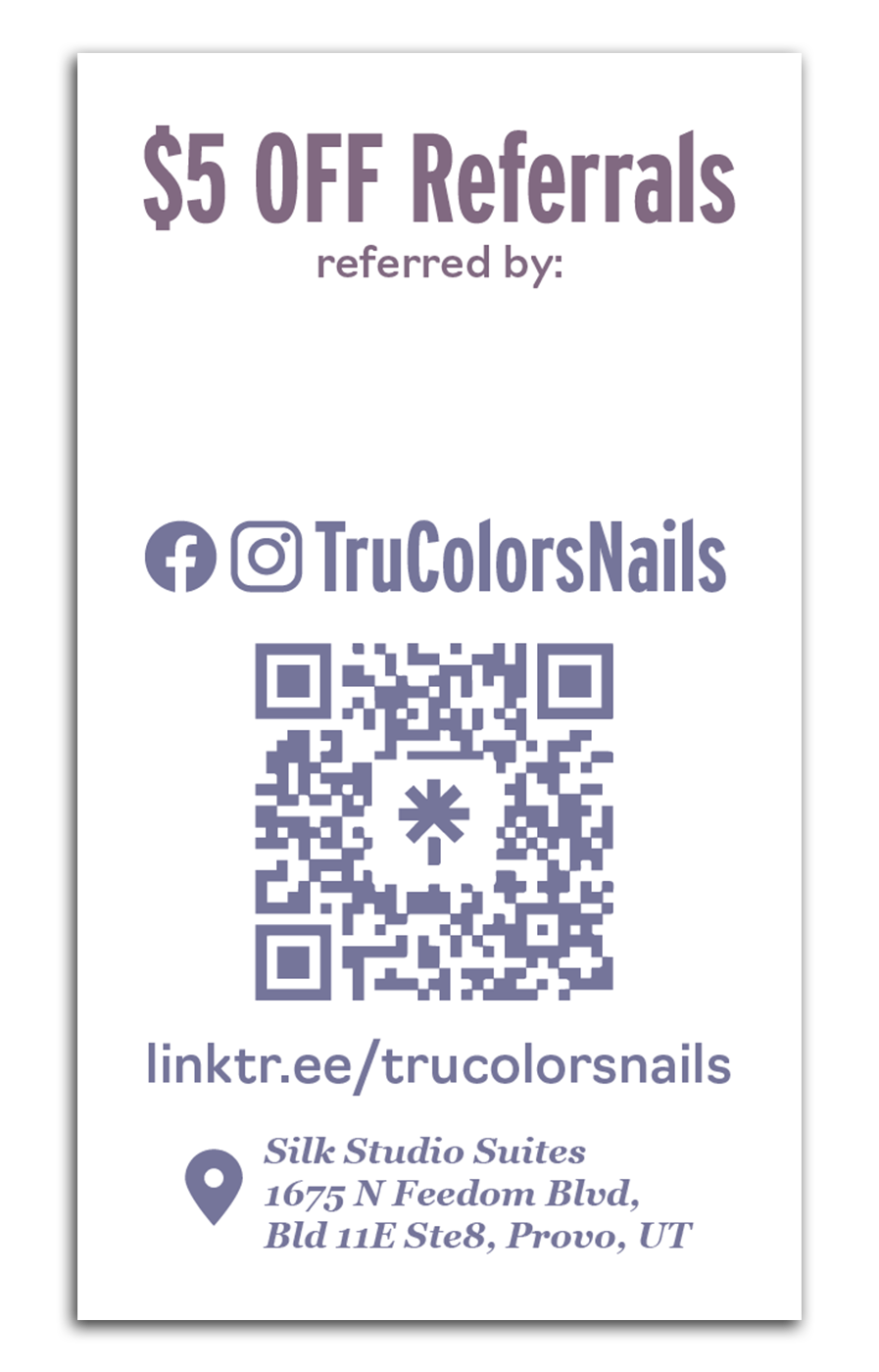
- Create new logos, business cards, patterns, and social media banners.
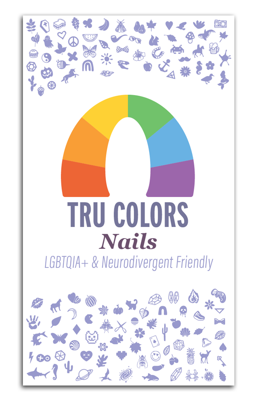
- Tru Colors Nails is a queer owned, LGBT+ friendly, and neurodivergent friendly nail salon in Provo, Utah.
- TCN provides service to anyone regardless of gender.
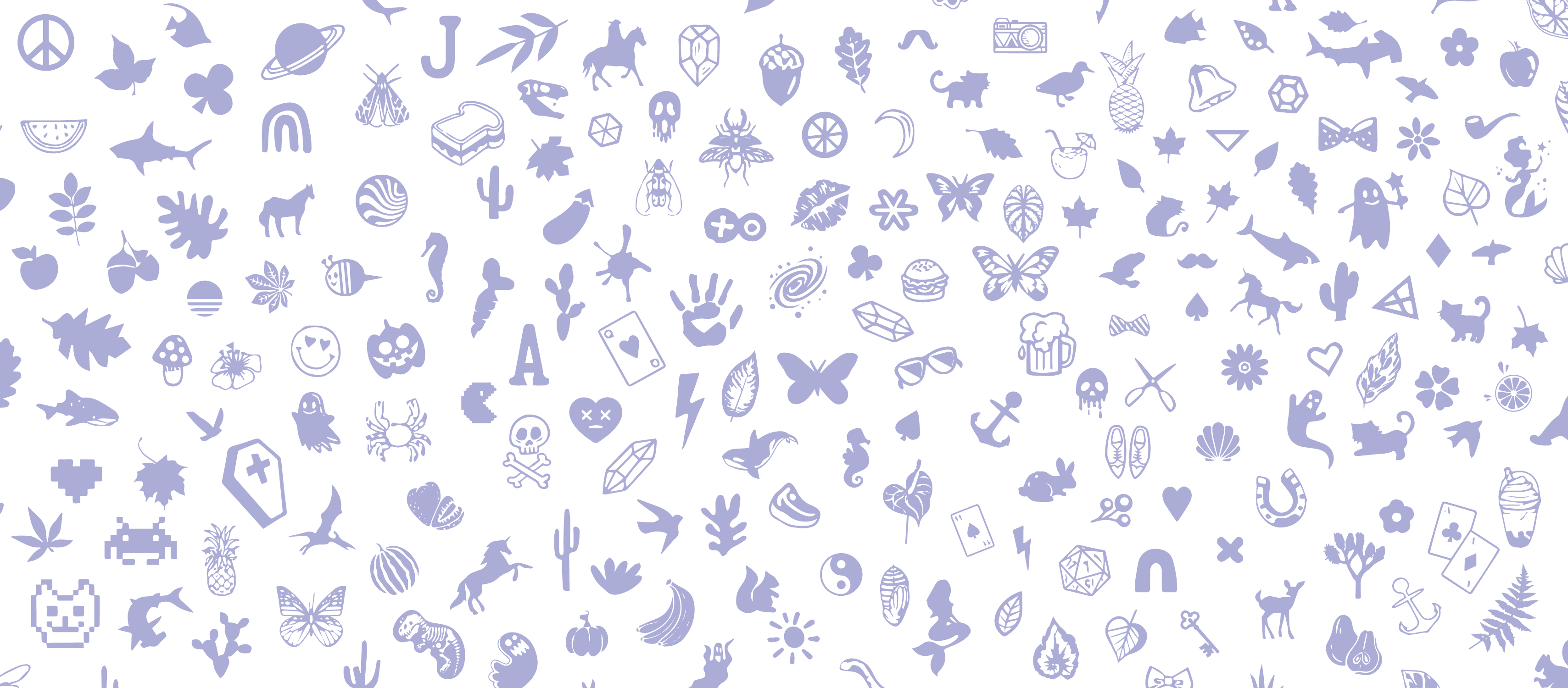
- TCN also specializes in nail-stamp-art with thousands of stamps, icons, pictures, etc.
- Too many full saturation colors in a design/brand can be visually straining, confusing, and inconsistent. Many successful brands solve this by using a limited color palette, but this can be difficult for queer businesses and organizations where a rainbow is crucial to their mission.
- Creating a logo that lets people know it is a nail salon, while choosing a design that is unique, isn’t too boring, avoids cliches, and isn’t over complicated.
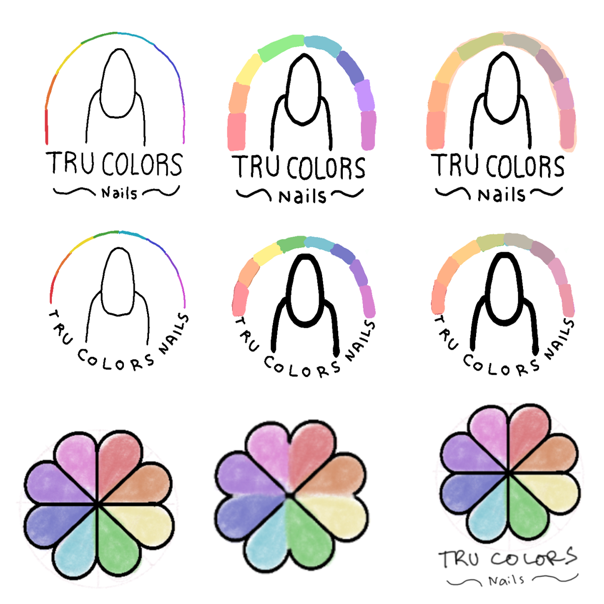
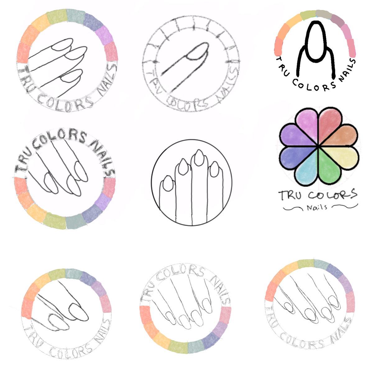
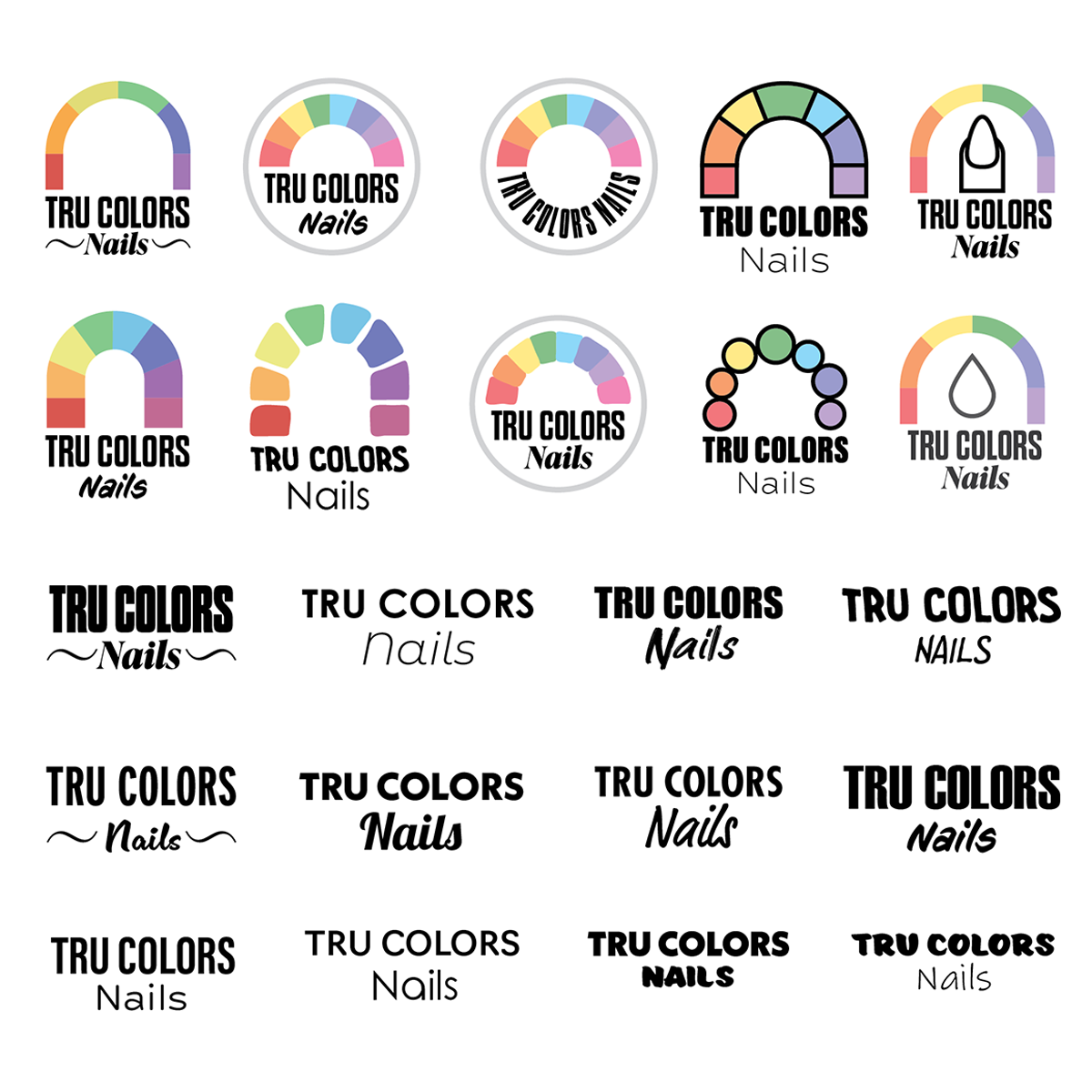
- Keeping a rainbow in the designs and branding, but making it smaller, therefore drawing your eyes to it.
- Creating a logomark that is visually interesting and maintains meaning even in black and white.
- Choosing six colors for the rainbow that are slightly less intense or less saturated to give some visual relief.
- Choosing two dominant hues for a cool-color palette to be used in juxtaposition with the new rainbow logomark.
- Creating a pattern and icon set using actual images of the salon’s stamps - letting potential clients know what kind of designs they can get onto their nails.
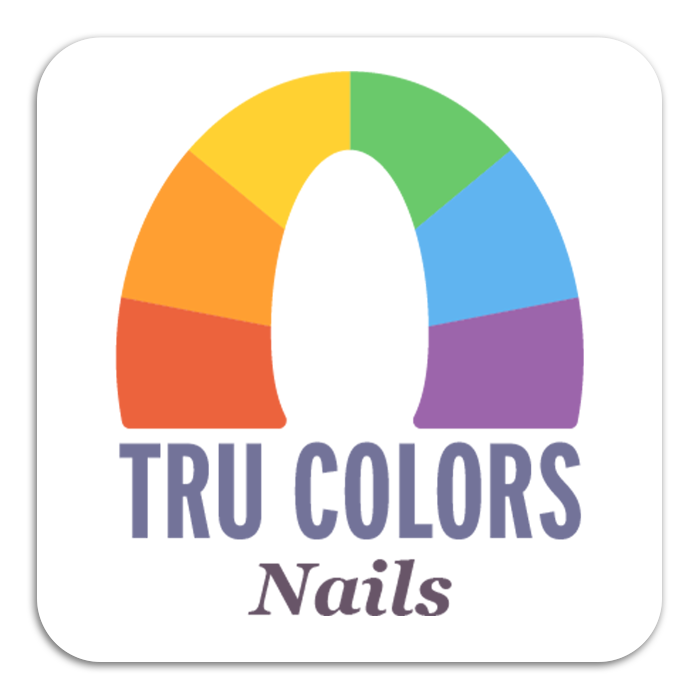
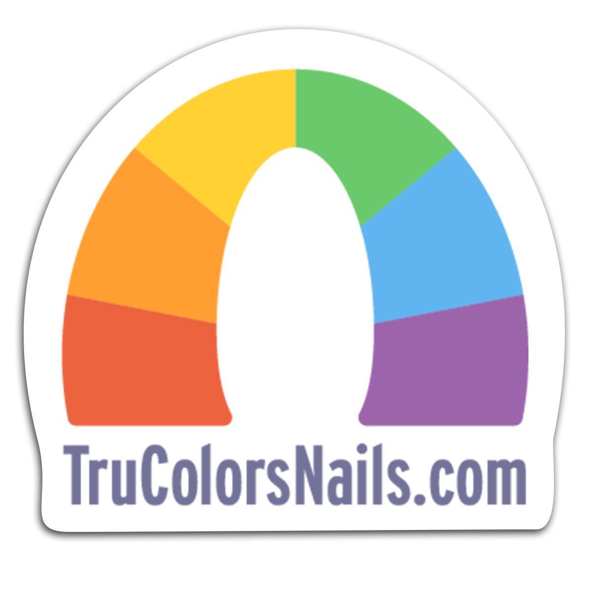
- The final logo is a rainbow, but a key feature is the negative space under the rainbow forming the shape of a fingernail.
- Carving this negative space out of the rainbow also produces a shape that resembles the stone arches in Utah, where the nail salon is located.
- The new logo flips the traditional direction of stripes on a rainbow. This creates an additional meaning of a finger pointing and choosing from a palette of colors.